BACKGROUND
Brightspeed is the nation's fifth largest ILEC valued at over 7.5 billion USD. It is expanding its
fiber optics network to reach 1 million new connections by 2023. As a spin-off of Lumen and CenturyLink,
it serves 6.5 million locations in rural and suburban areas. Brightspeed focuses on fiber-based telecom
solutions for B2C and B2B markets in the southeast, southwest, and great lakes regions.
THE PROBLEM
In November 2021, Apollo Global Management (A hedgefund) struck a deal with Lumen Technologies to acquire Brightspeed.
After the acquisition, the
website experience felt disjointed due to branding associated with Lumen and
CenturyLink webpages, as well as subpar navigation and support pages. As a result, a lot of
existing users dropped off, leading to client attrition.
Since then the organiztion has been affected with existing users dropping of the service and client attrition.

MY ROLE & ROADMAP
 I joined the team as senior product designer and
worked alongside a UX writer, UX strategist and supervised two UX designers for the whole migration effort. My team was brought on to help the new transition from Lumen (formally CenturyLink) to Brightspeed.
We immediately had two main goals that would span close to a years worth of work.
I joined the team as senior product designer and
worked alongside a UX writer, UX strategist and supervised two UX designers for the whole migration effort. My team was brought on to help the new transition from Lumen (formally CenturyLink) to Brightspeed.
We immediately had two main goals that would span close to a years worth of work.
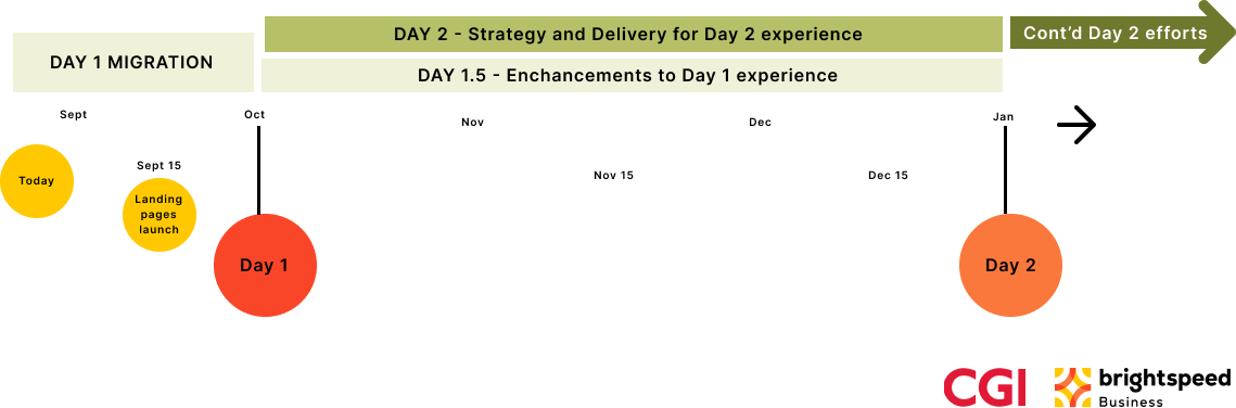
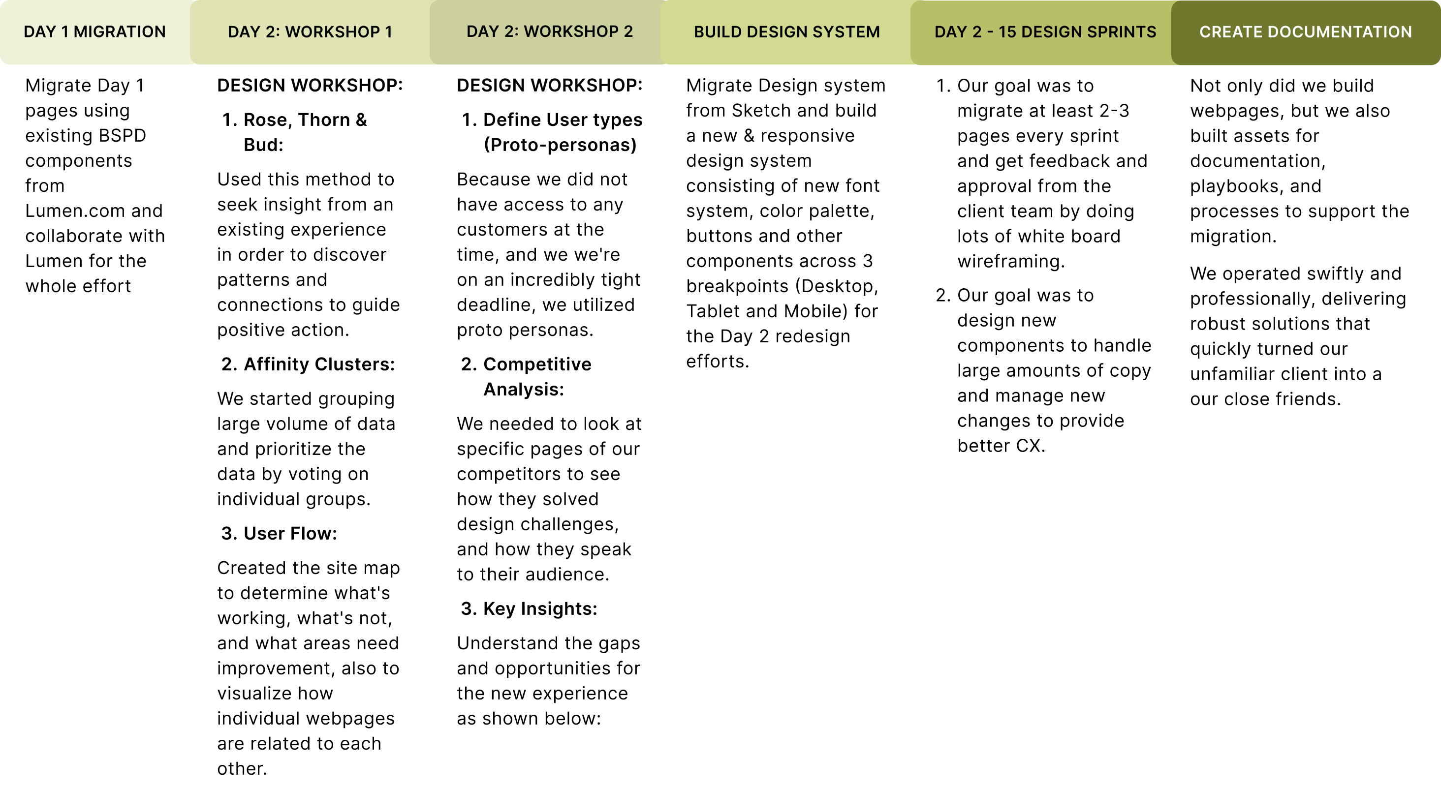
- Help with the migration of "cloned pages" from Lumen.com and Centurylink.com to the new Brightspeed.com Business experience and launch by October 2022.
- Build a new 2.0 website experience for Brightspeed and launch mid January 2023.
OUR APPROACH & DIRECTION
DEFINING THE CHALLENGE
DAY 2 - BUILD 2.0 EXPERIENCE
Before diving in and starting to build a new experience, there was a lot of planning and strategy before we could start to design, which involved:
- Design workshop
- Rose-thorn-bud
- Affinity mapping
- User flow
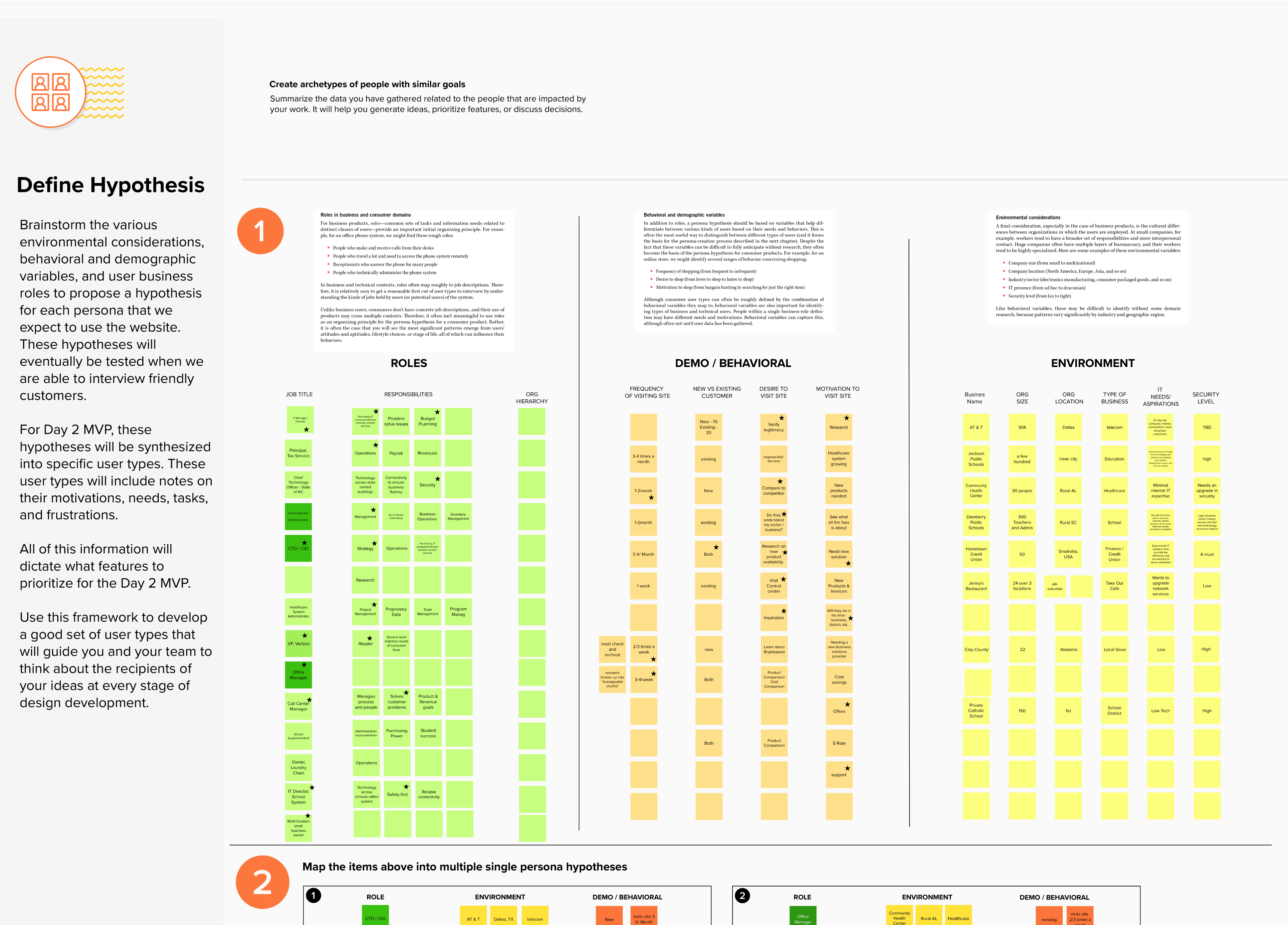
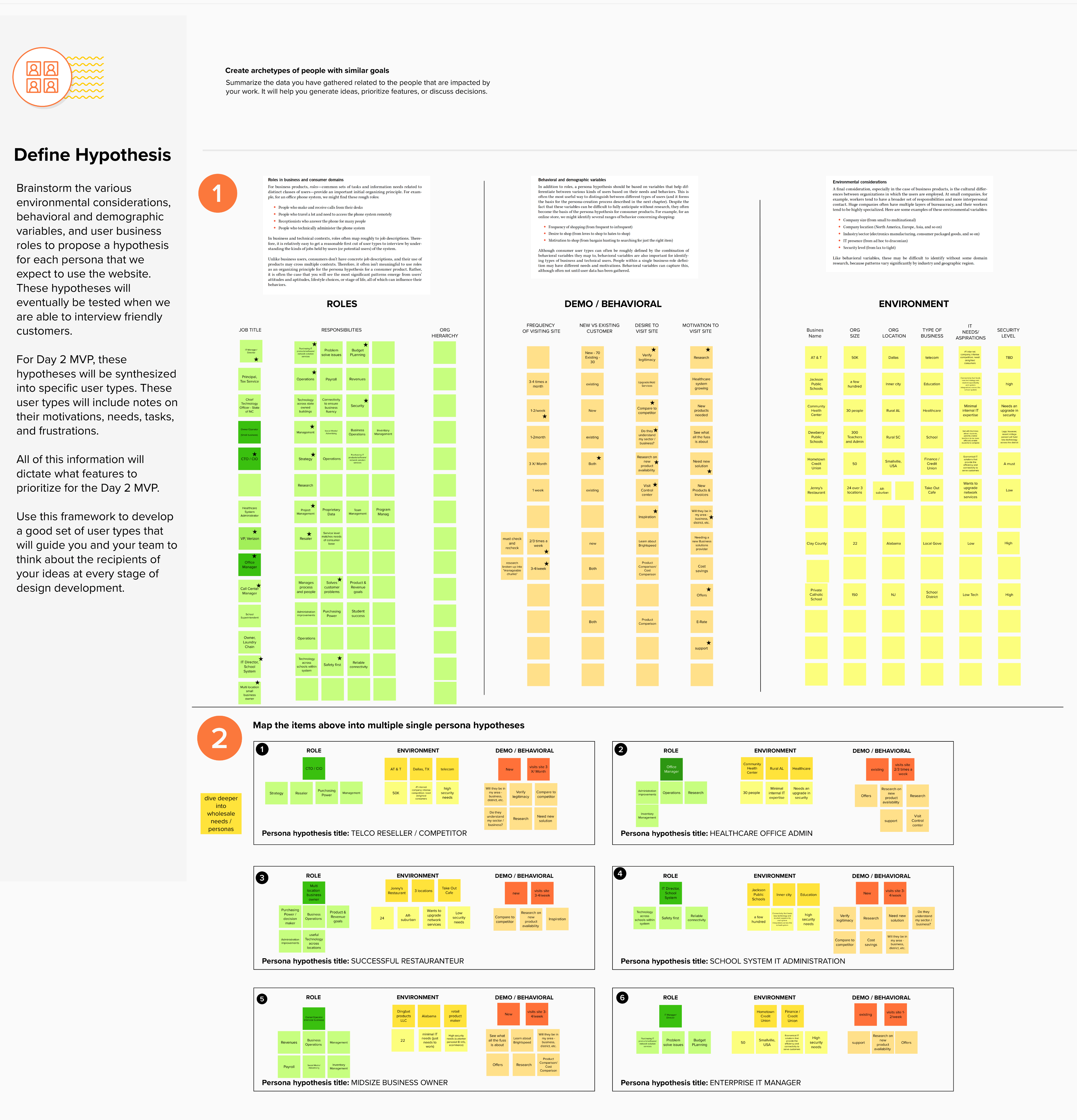
- Define user types (Proto-personas)
- Competitive analysis
- Define requirements
- Design systems
- Iterative working sessions
- Support development efforts
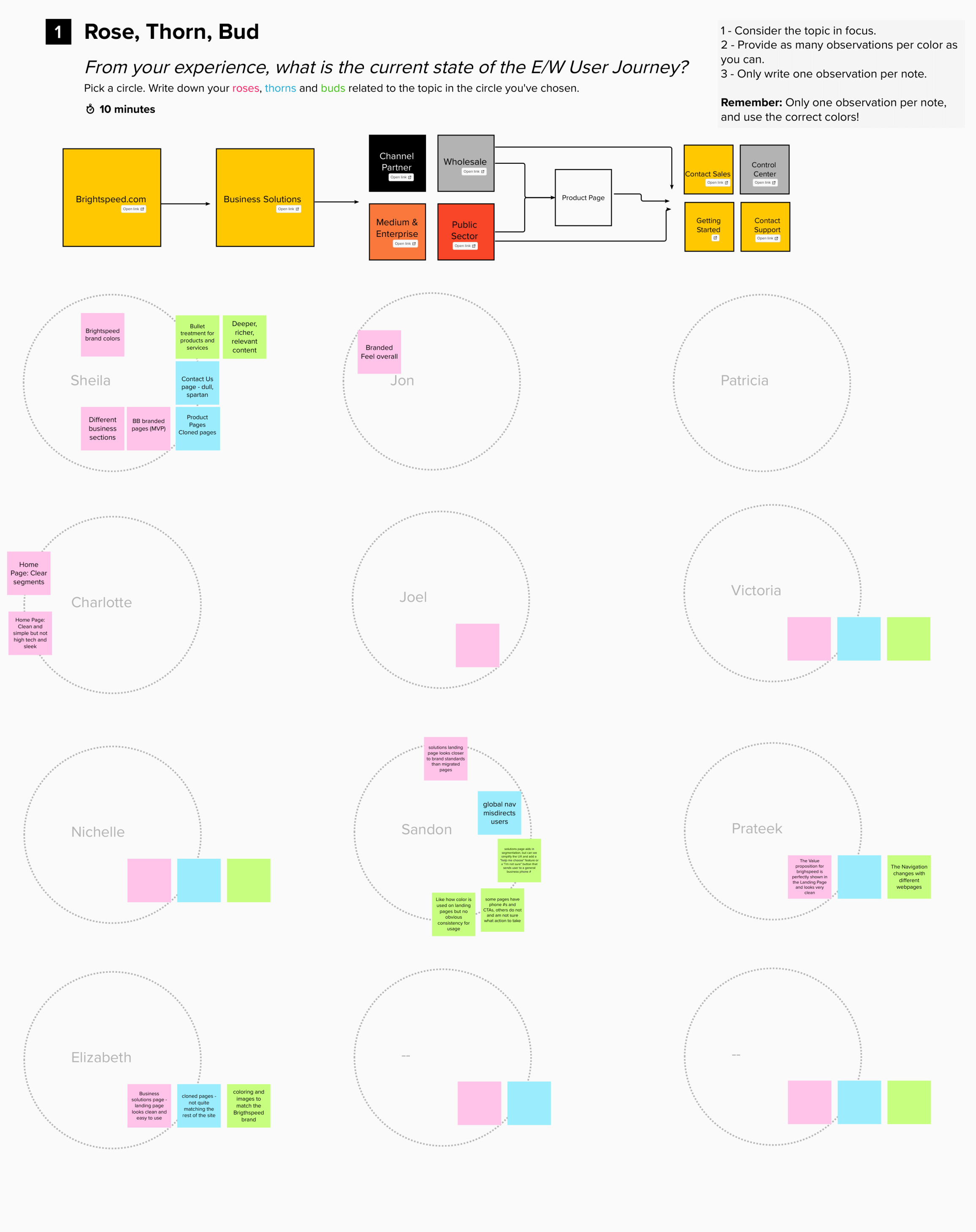
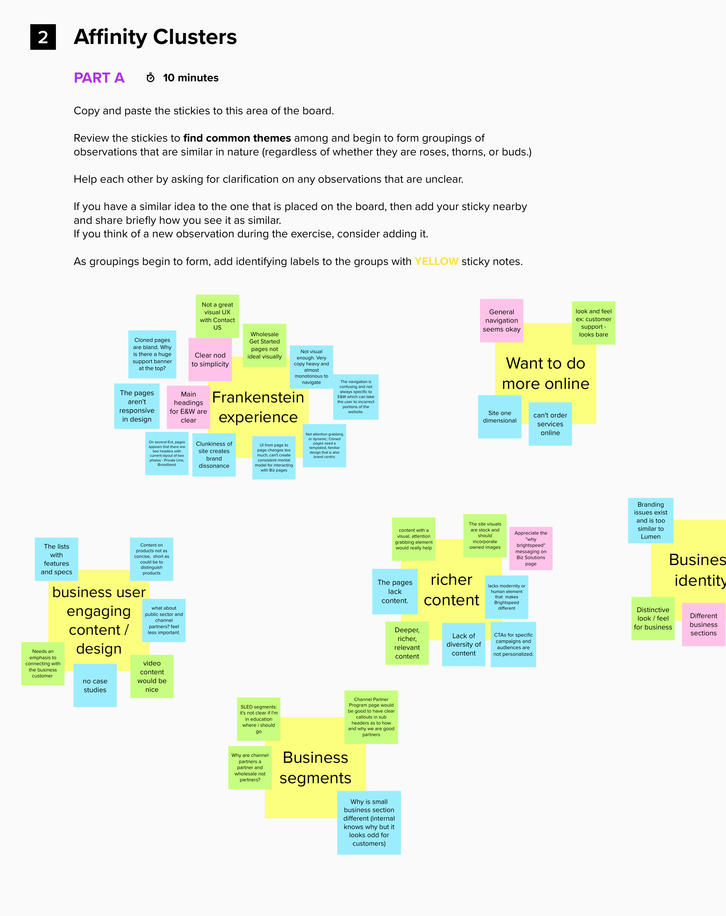
DESIGN WORKSHOP: ROSE, THORN, BUD & AFFINITY CLUSTERS
Used these two methods together to seek insight from an existing experience in order to discover patterns and connections
to guide positive action. It's best to use this method since I needed to clarify goals and objectives, define
immidiate needs and create focus. This method helped a way to provide structured way to reveal participant's thoughts, observatitions and
concerns, generates healthy discussion and frames challenges in a way that leads a healthy path forward.
PICTURING THE TARGET AUDIENCE
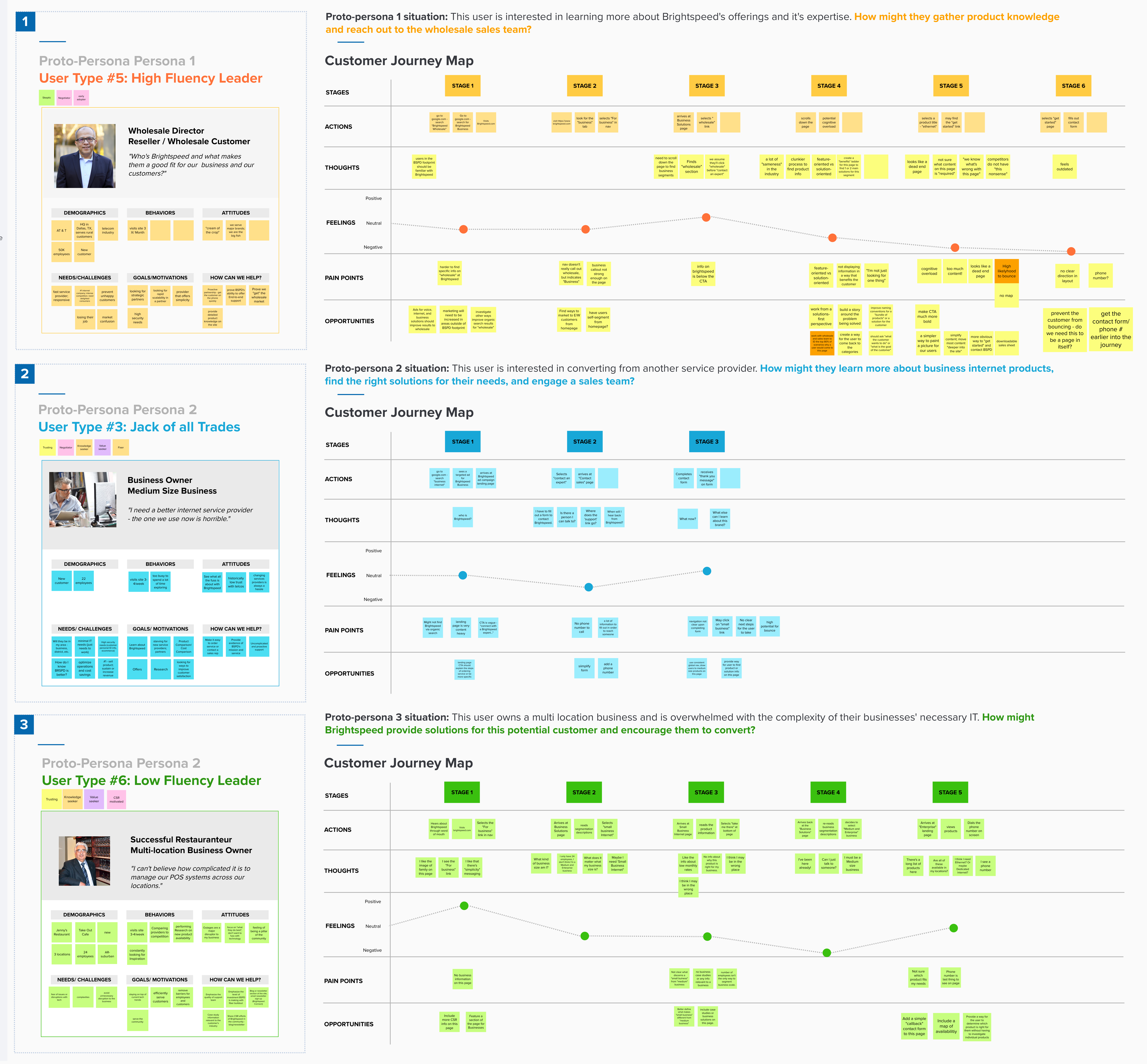
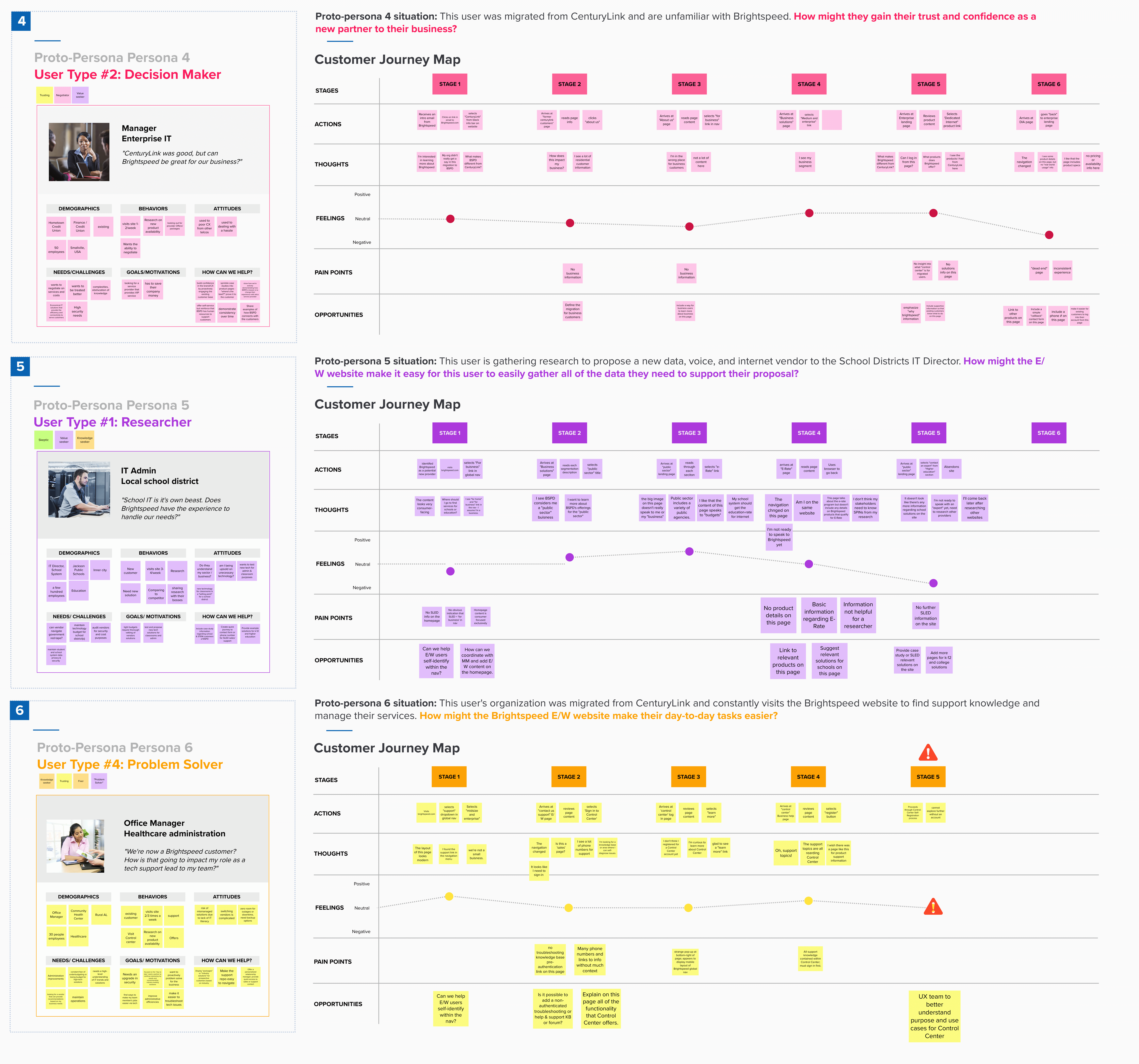
Since we did not have access to any customers at the time, and we were on an incredibly tight deadline, we utilized proto personas.
 USER JOURNEYS
COMPETITIVE ANALYSIS
We needed to look at specific pages of our competitors to see how they solved design challenges, and how they speak to their audience.

 Detailed competitive analysis of Spectrum, Verison, At&t and Google fiber business landing page:
KEY INSIGHTS & OPPORTUINITIES
Through user interviews and workshops with our stakeholders we understood the gaps and opportunities for the new experience as shown below:
USER FLOW
We started to create the site map to determine what's working, what's not, and what areas need improvement, also to visualize how individual webpages are related to each other.
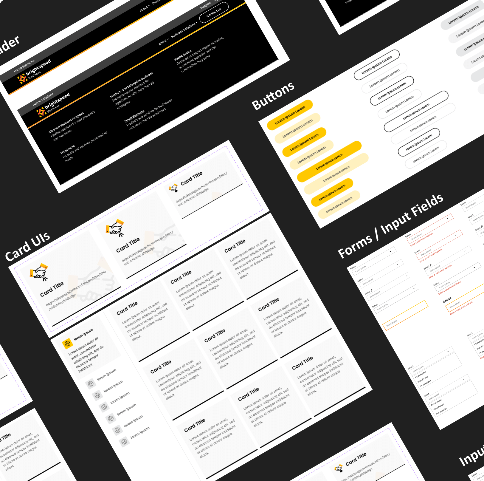
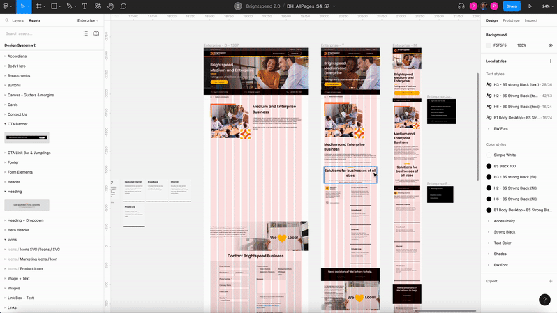
2.0 DESIGN SYSTEM
I took full ownership to research, create and maintain the branding guidelines and new design system in Figma which was migrated from Sketch. More than 15 new components were built accross 15 design sprints
to satisfy the new design needs and improve the user experience.
Design Guidelines:
Responsive UI Elements:
WORKING SESSIONS & 15 SCRUM SPRINTS
We started our sprints and prioritized tasks for redesinging Business landing page first followed by segment pages, product pages and support pages. All the tasks were borken down into small stories on Jira, which were deligated to designers, writers and developers.
Every sprint were 2 week long with 4 working sessions in each sprint. We delivered solutions every working session backed with data and user research and received good amounts to feedback which we incorporated in iterative working sessions.
We tried to incorporate and balance what the client wants while maintaining business goals and user needs. This helped us maintain a very good relationship with them.
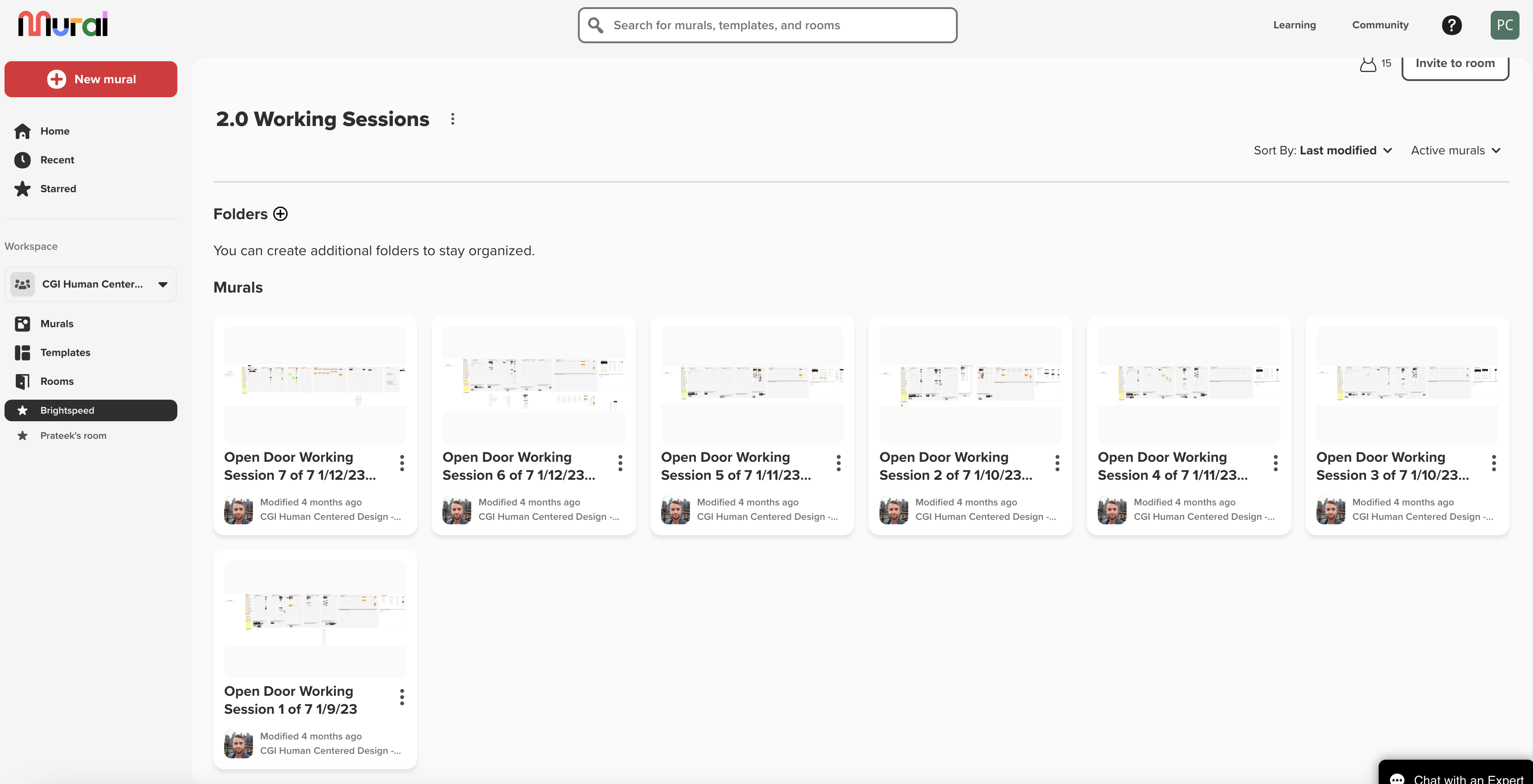
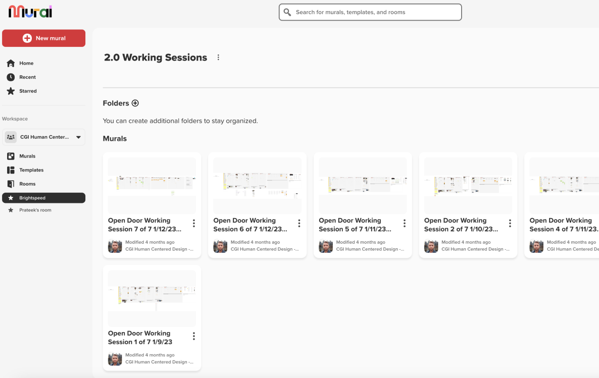 Working sessions on Mural.
Click on the window above to view
Working sessions on Mural.
Click on the window above to view
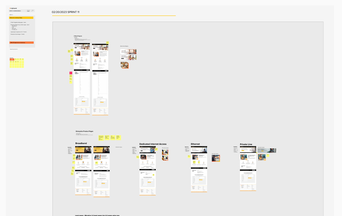 Working Session in detail.
Click on the window above to view
Working Session in detail.
Click on the window above to view

During the working sessions, we designed mid to
high-fidelity prototypes to receive iterative feedback. We started to create pixel perfect Hi-fidelity prototypes based on the feedback of 4th and final working session of every sprint.

RESULTS
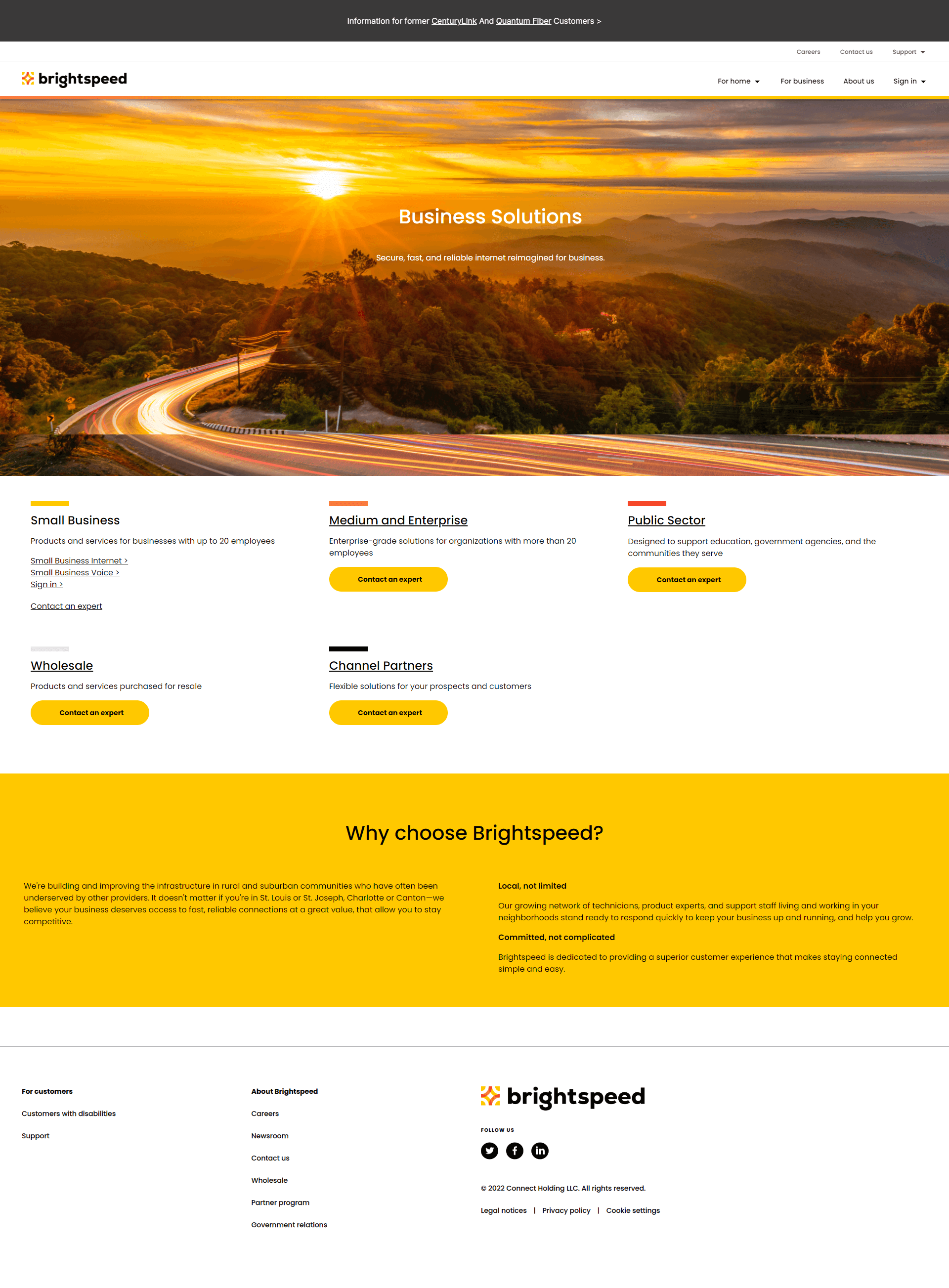
BRIGHTSPEED BUSINESS LANDING PAGE
We first built the Business Solutions page using components that we built based on the requirements we gathered from our competitive analysis, proto personas, and our clients at Brightspeed. This pages purpose is to help users navigate to their business segment (Enterprise, Wholesale, Public Sector, Small Business, or Channel Partners.) We wanted to highlight different areas of support and sales on the page, and touch on subjects like upcoming events, promotions, and of course content to support the brand.
We weren't able to modify the branding of few components like the 'Contact form' since it was connected to the Marketo form from the Lumen website experience and due to tight deadlines, we coudln't afford to develop a new component for it. The first built components included:

- A hero header / carousel
- A link bar
- Image + text component
- Card boxes with icons
- Contact bar (Sales & support)
1.0: After migration
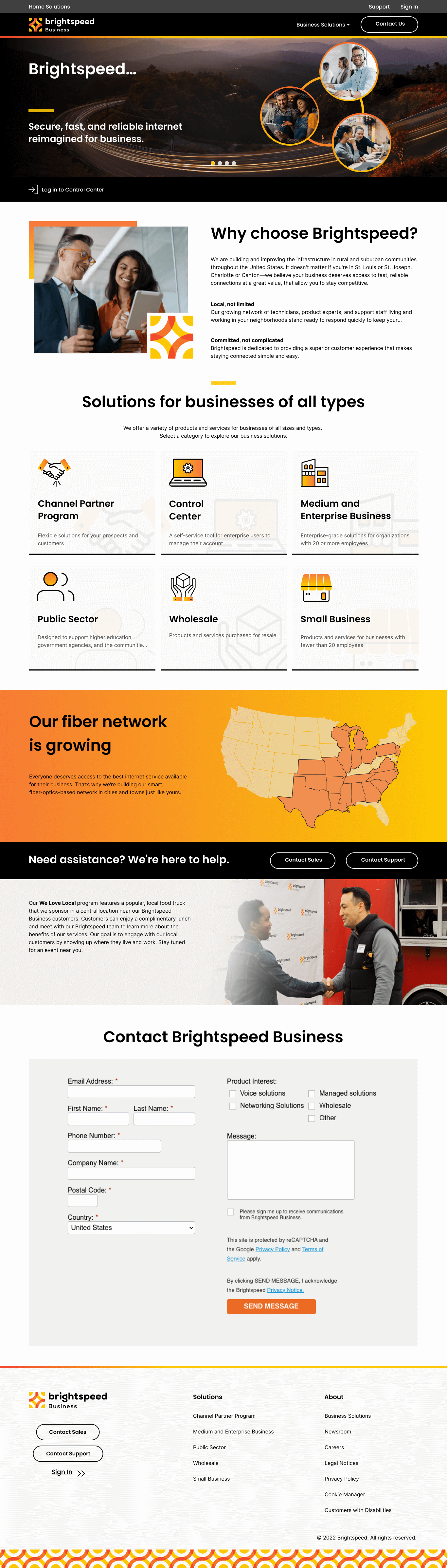
PRODUCT SEGMENT
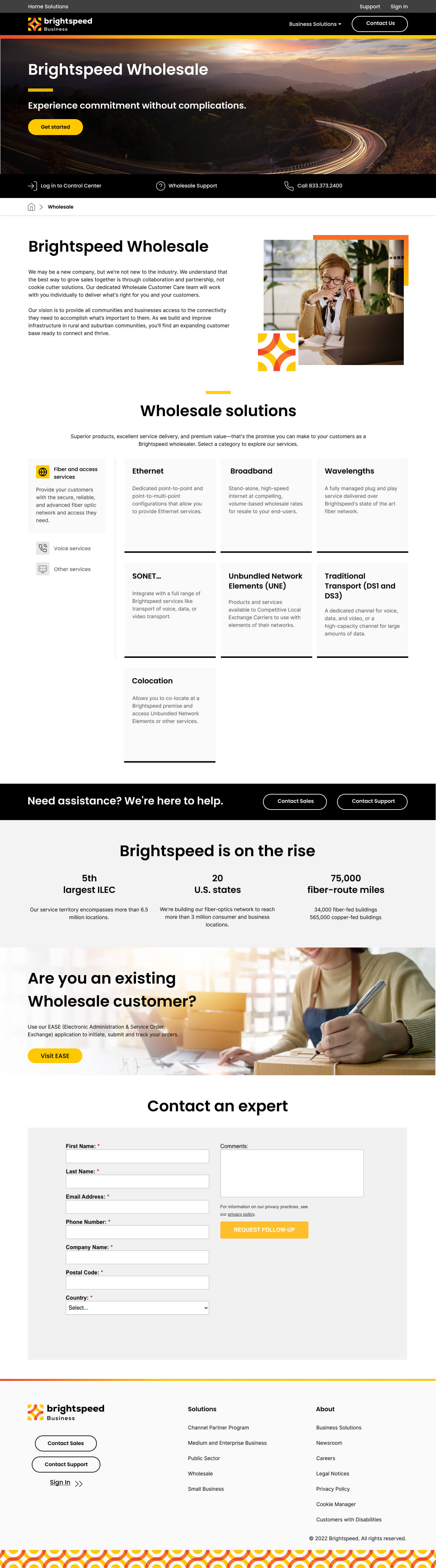
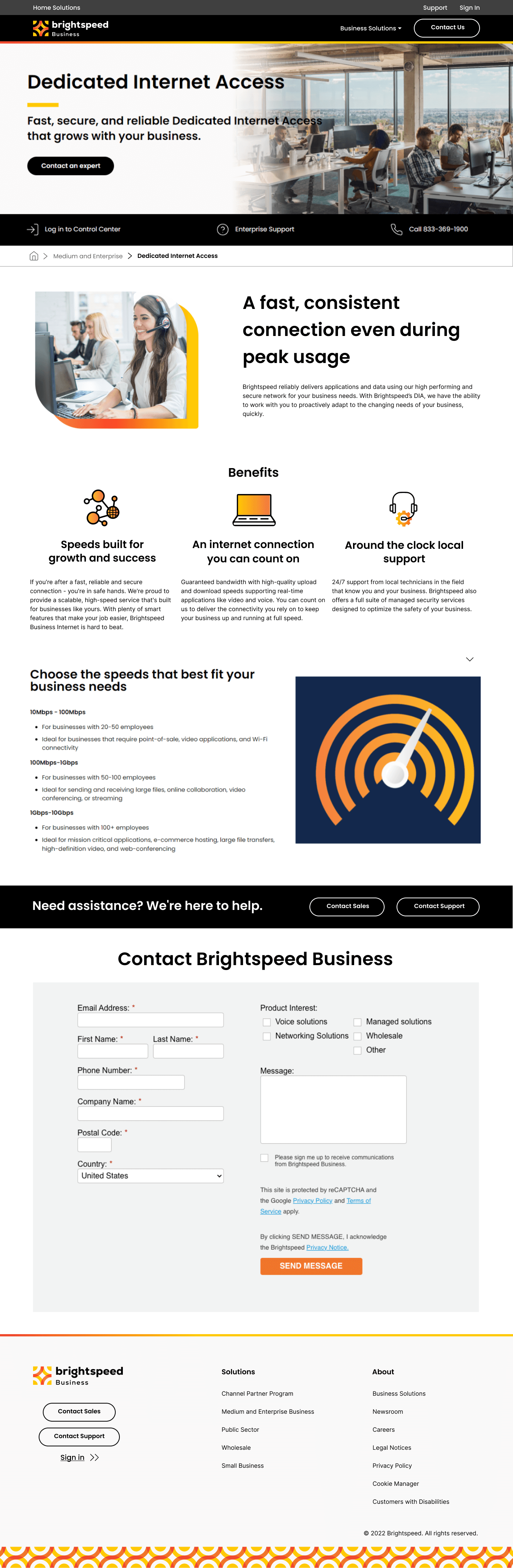
Next on our list was a product segment page, and we started with Wholesale due to client needs. Many components were reused from our Business Solutions landing page, but we also had a few new ones including:

- Breadcrumbs
- Product selection
- 3 segment component
1.0: After migration
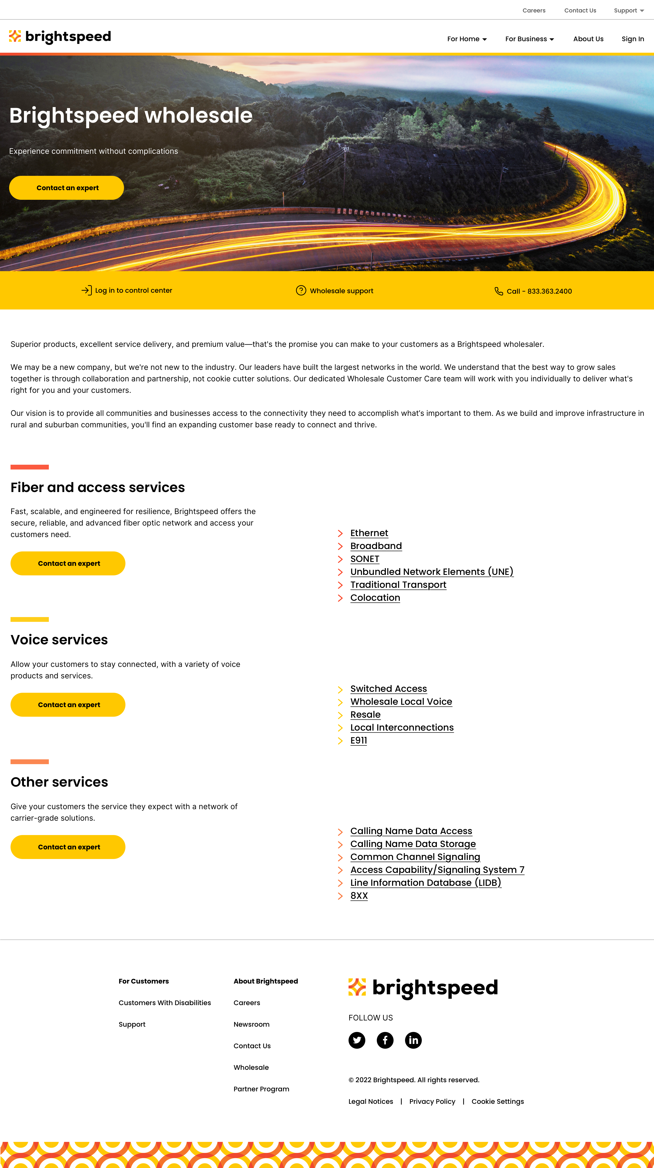
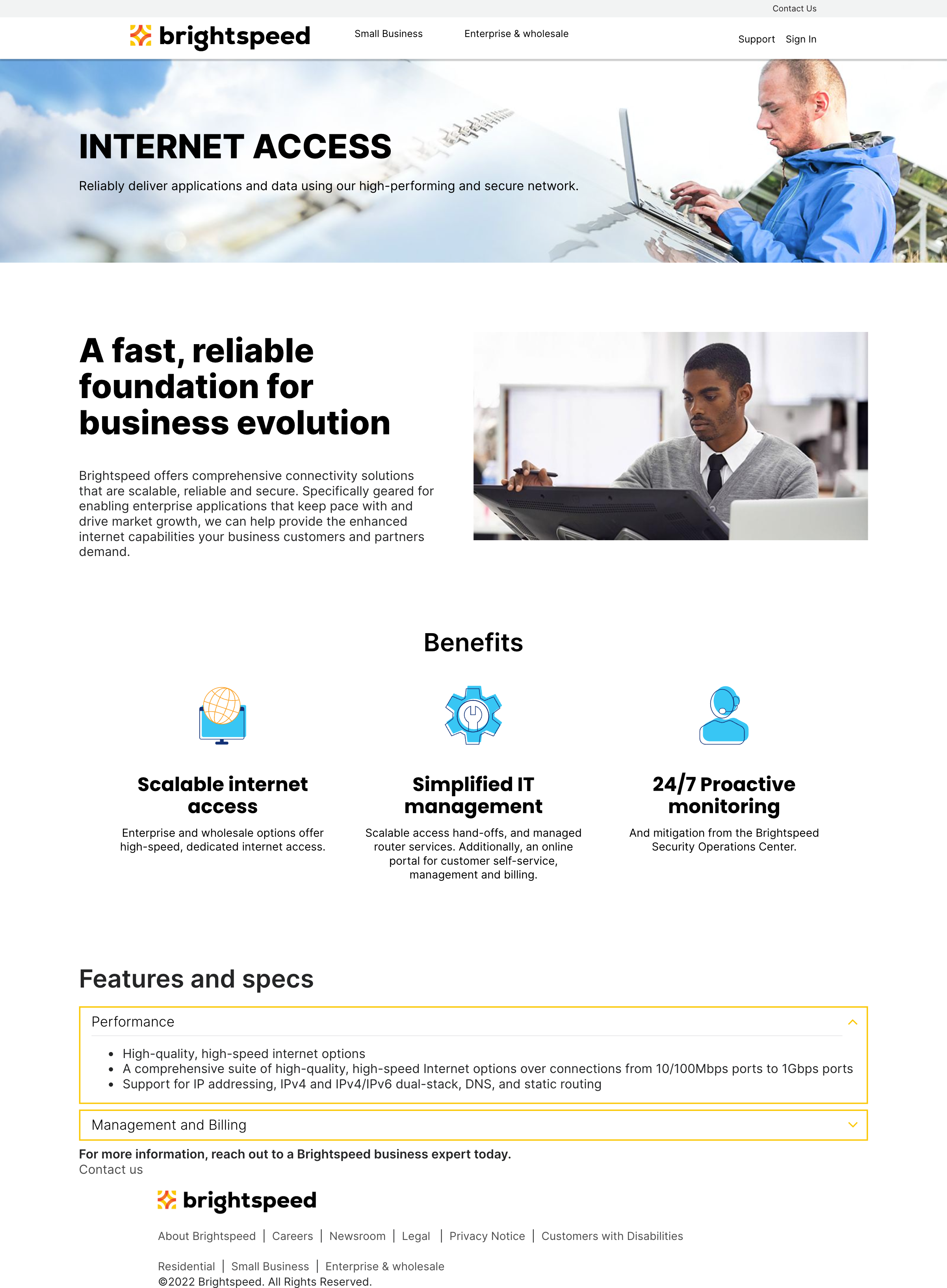
- Breadcrumbs
- New Brightspeed icons
- New Image Component
- Comprehensible writing

1.0: Lumen Design
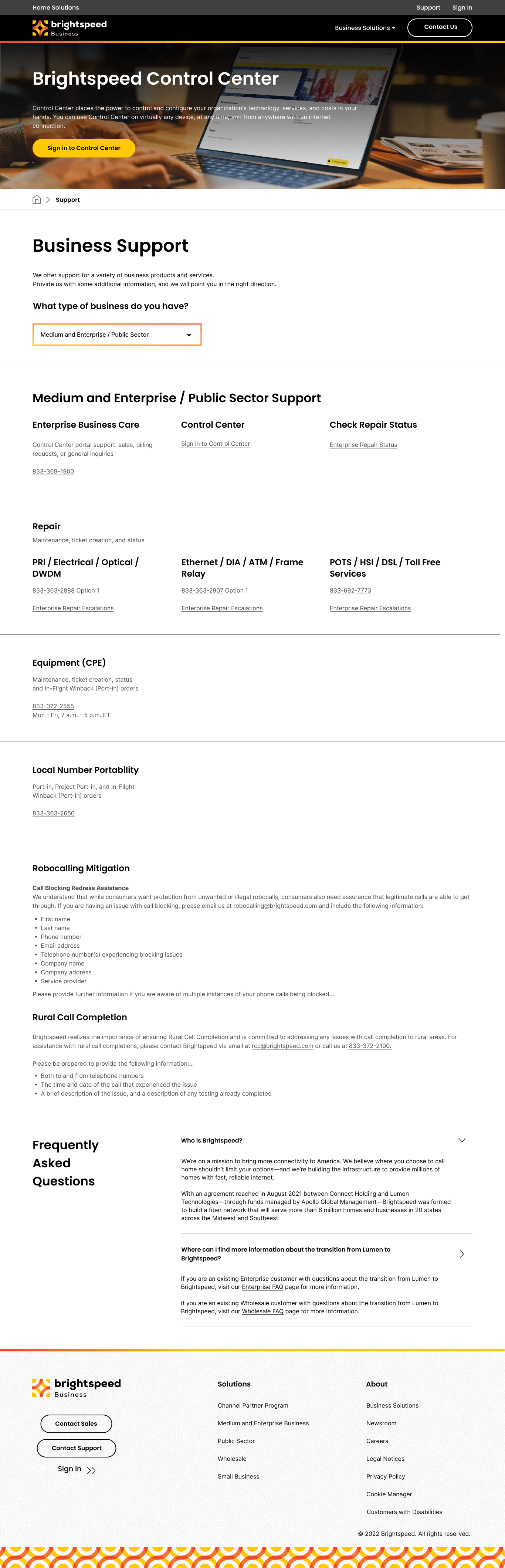
SUPPORT PAGES
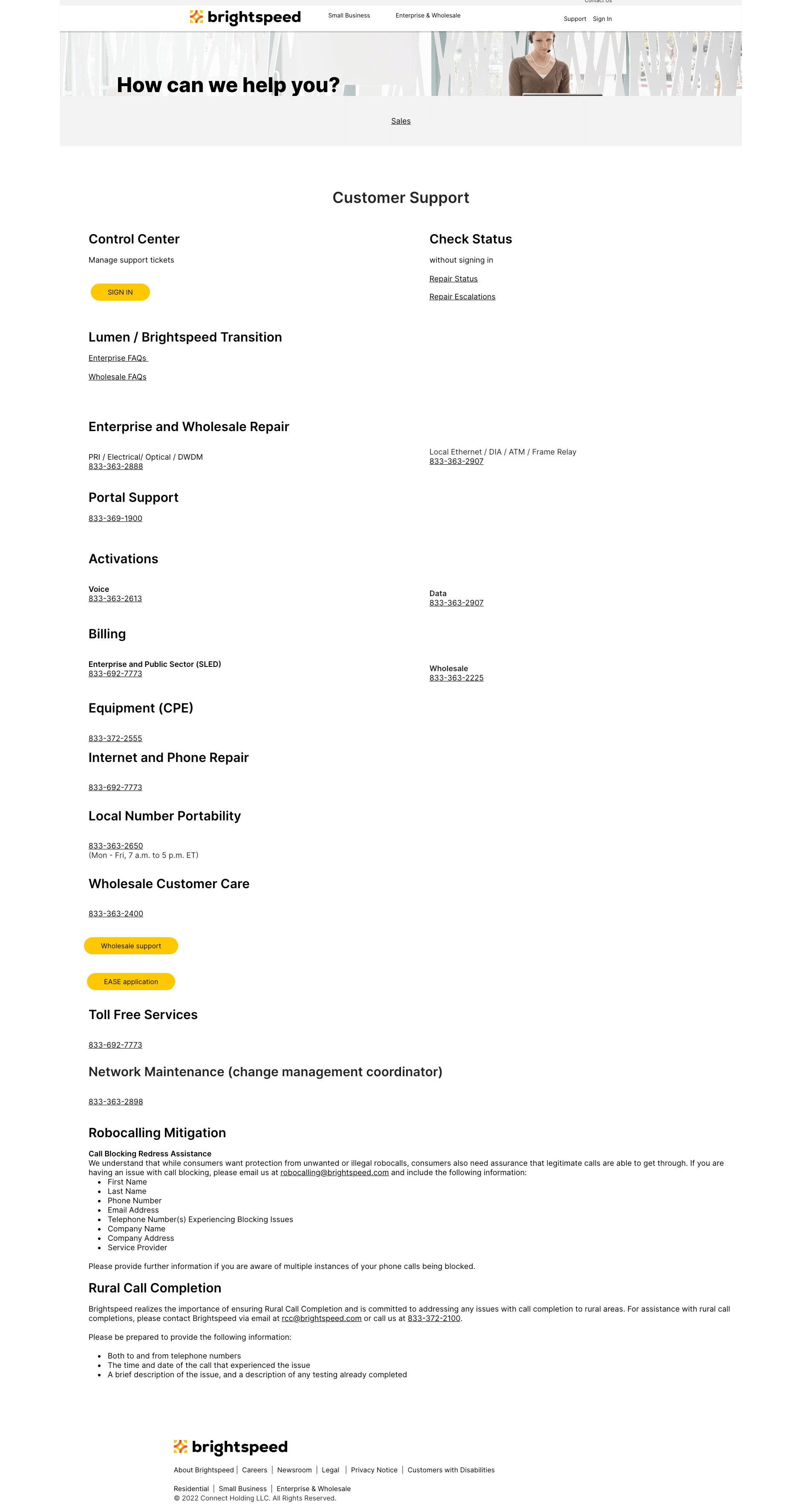
Contact support and Contact Sales were the last set of webpages we had to redesign. We provided a complete new solution for the whole segment with new functionality, components and content.
The Day 1 consisted of a large wall of text with an unclear direction for the user to ask for help. The new page were designed in a way that we
grouped segments and displayed them separately using a dropdown selector, so users could specifically select the type of help they are looking for rather than just searching for it in wall of text. The new components used in the page are:
- Breadcrumbs
- Heading + Dropdown
- 3 segment component
- Accordions
1.0: After migration
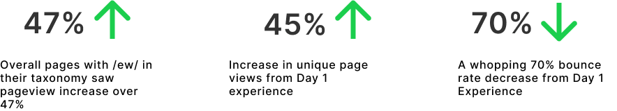
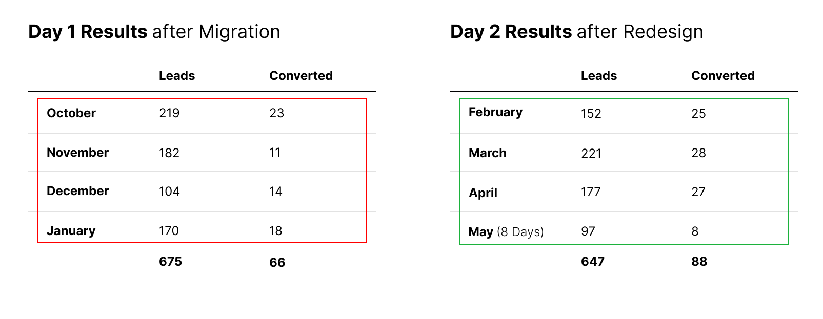
Please look at the metrics below that compares the Day 1 vs Day 2 activity generated via analytics