
October 2019 - May 2022
BACKGROUND The Shared Savings Program is a voluntary program that encourages groups of doctors, hospitals, and other health care providers to come together as an ACO to give coordinated, high quality care to their Medicare beneficiaries.
The product is part of The Centers for Medicare & Medicaid Services (CMS), which is a federal agency within the United States Department of Health and Human Services (HHS).
The product is part of The Centers for Medicare & Medicaid Services (CMS), which is a federal agency within the United States Department of Health and Human Services (HHS).


THE PROBLEM
The Scope of the Shared Shaving Program grew significantly and needed a system that could support annual changes to program requirement for nearly 513 ACO organizations.
THE SOLUTION
The system needed a redesign to create a seamless, intuitive and improved user flow to meet the growing user needs.
MY ROLE I served as the primary UX designer for the project, leading the team for a duration exceeding 3 years.
I worked with a UX designer and researcher to gain insights into the challenges users face when it comes to searching, browsing, and managing visual complexity.
MY APPROACH


DEFINING THE CHALLENGE
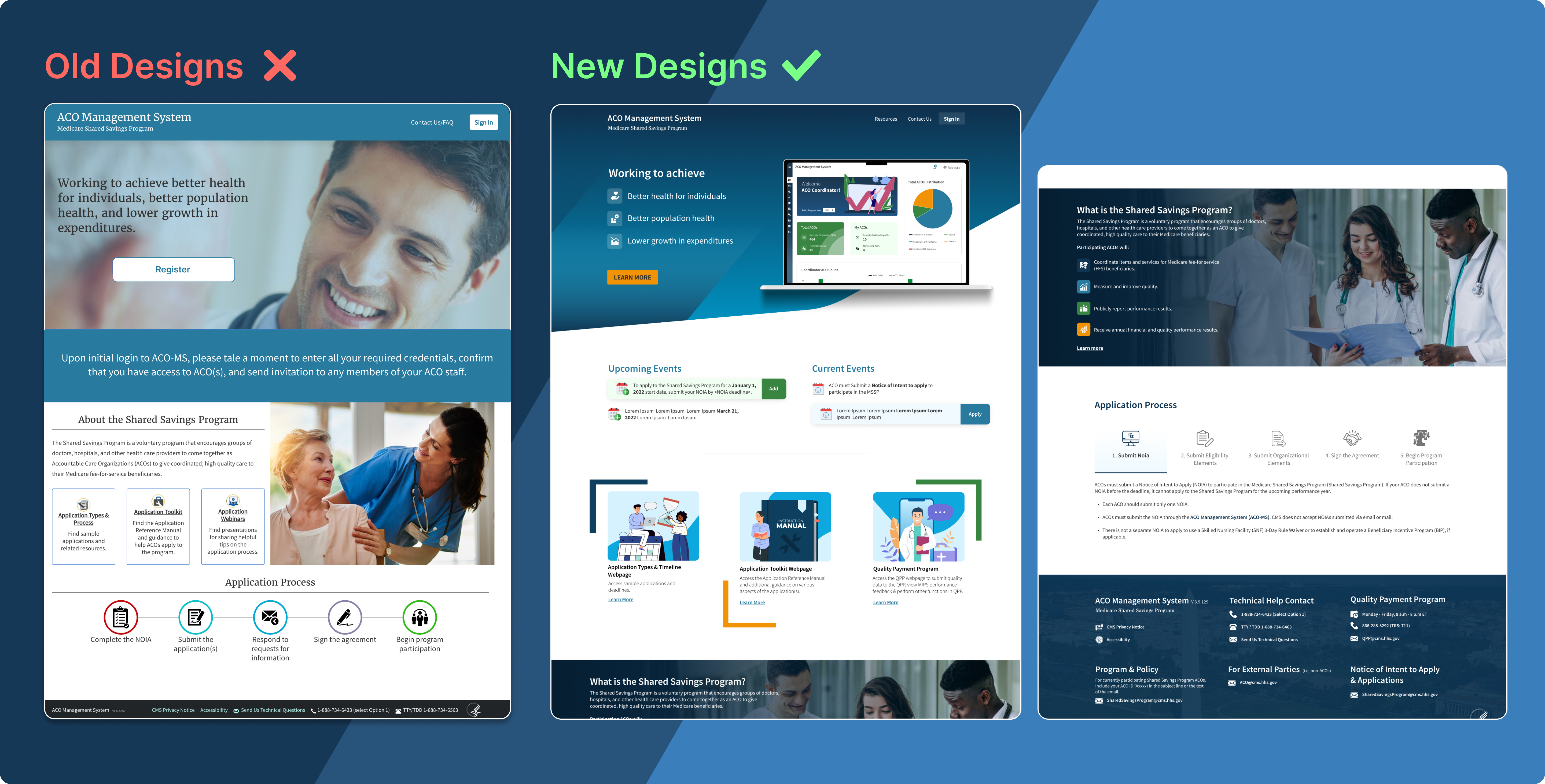
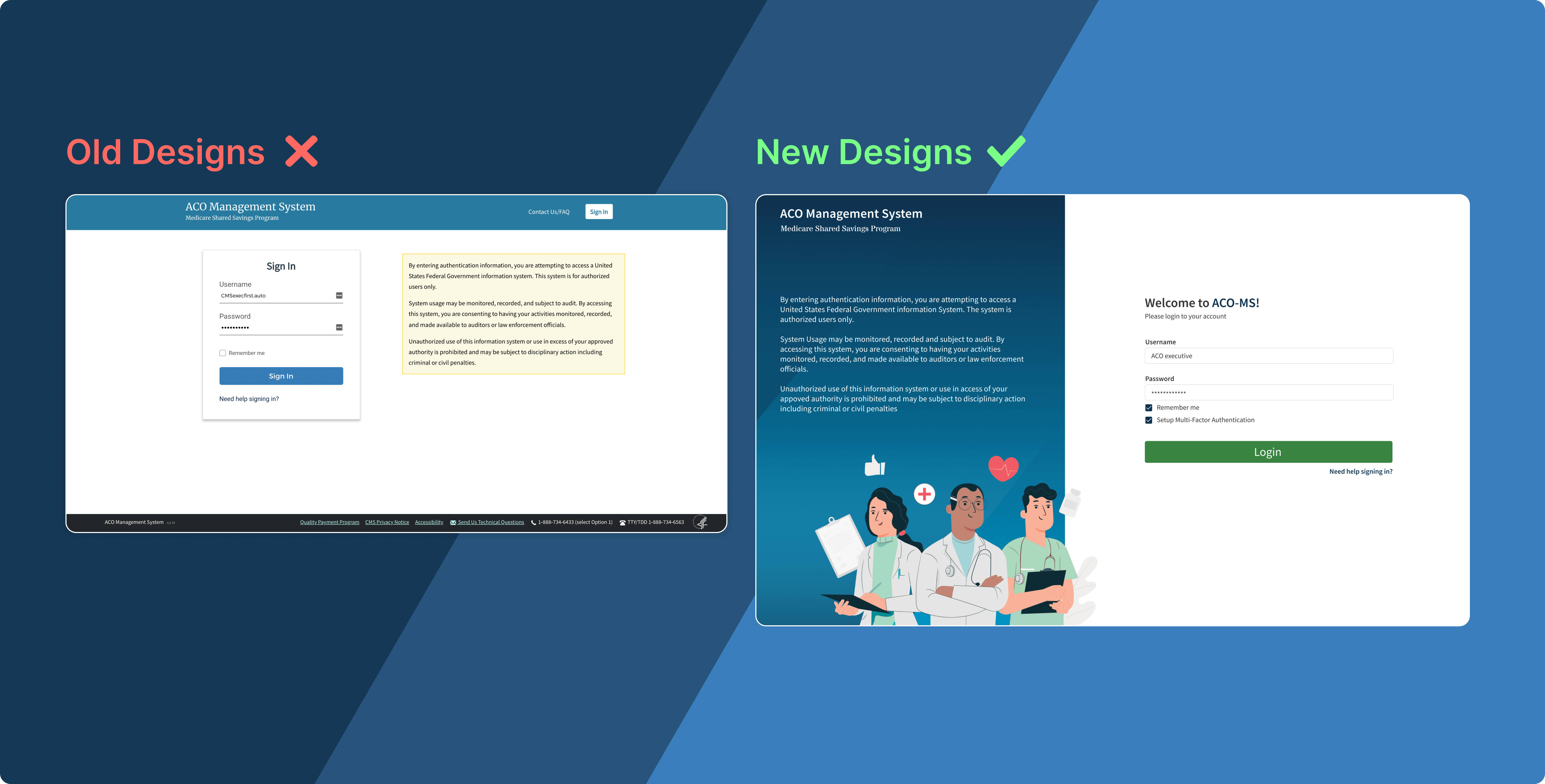
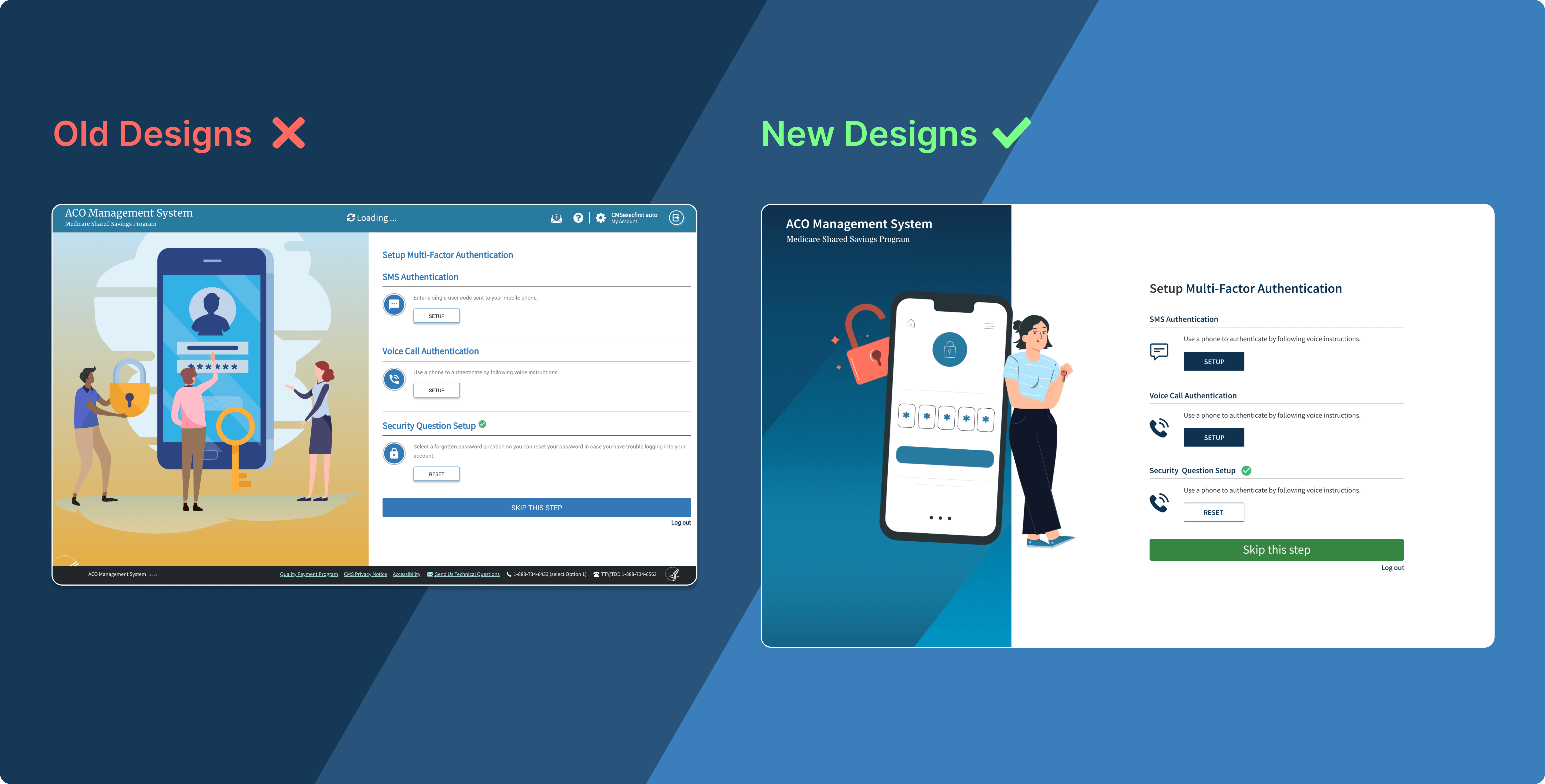
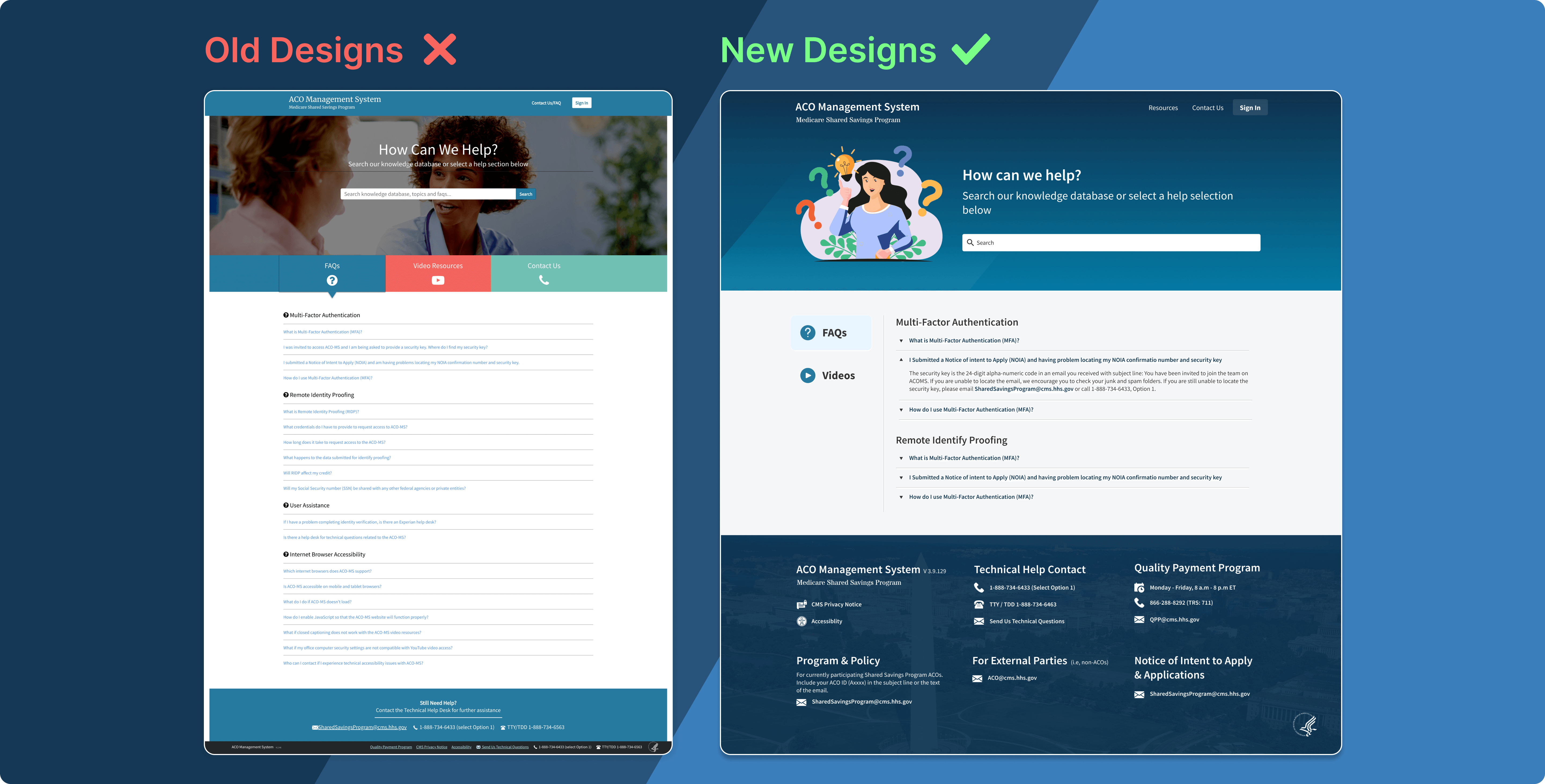
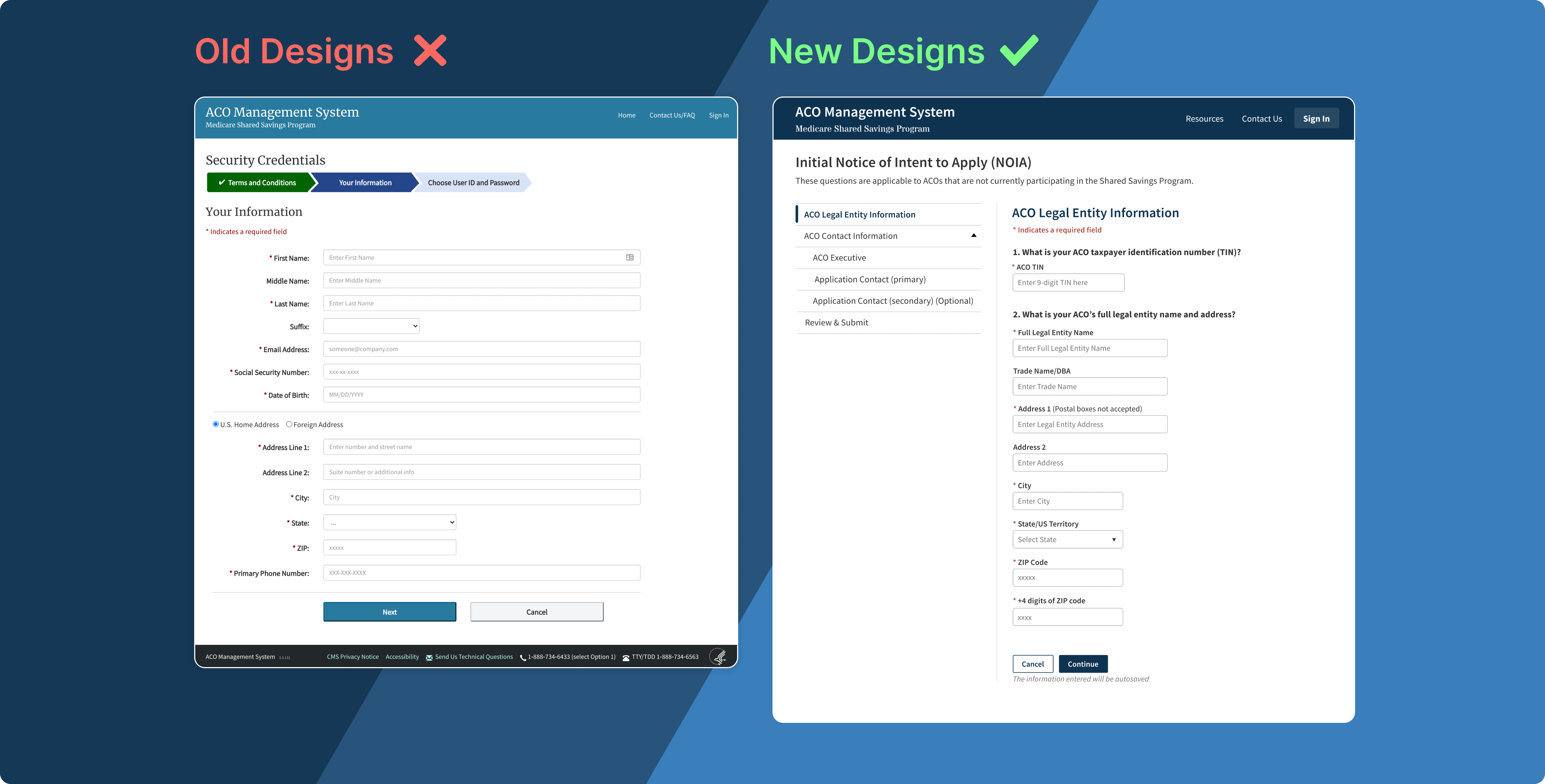
Landing Page, NOIA Application & Registration Redesign
The Registration and
NOIA application are two different process for the users to get verified and get access to the system. The users found the process very tedious, time consuming and complex.
The goal was to make the process simple for the user to navigate and get access to the system without having to wait.
Picturing the Target Audience
We interviewed the end users and created two personas to help us better understand our target audiences:

Key Insights
We interviewed the end users to understand their frustration from
the existing flow by asking why. With the feedback, we came up with
a userflow to reduce the complexity of the process. Few of the insights are as follow:

User Flow
We started to ideate multiple flows based on the initial feedback. After reiterating and discussing, we streamlined the flow to a very simple yet time saving process for the user. Below is a difference between the existing and new flow:
Old User Flow

New User Flow

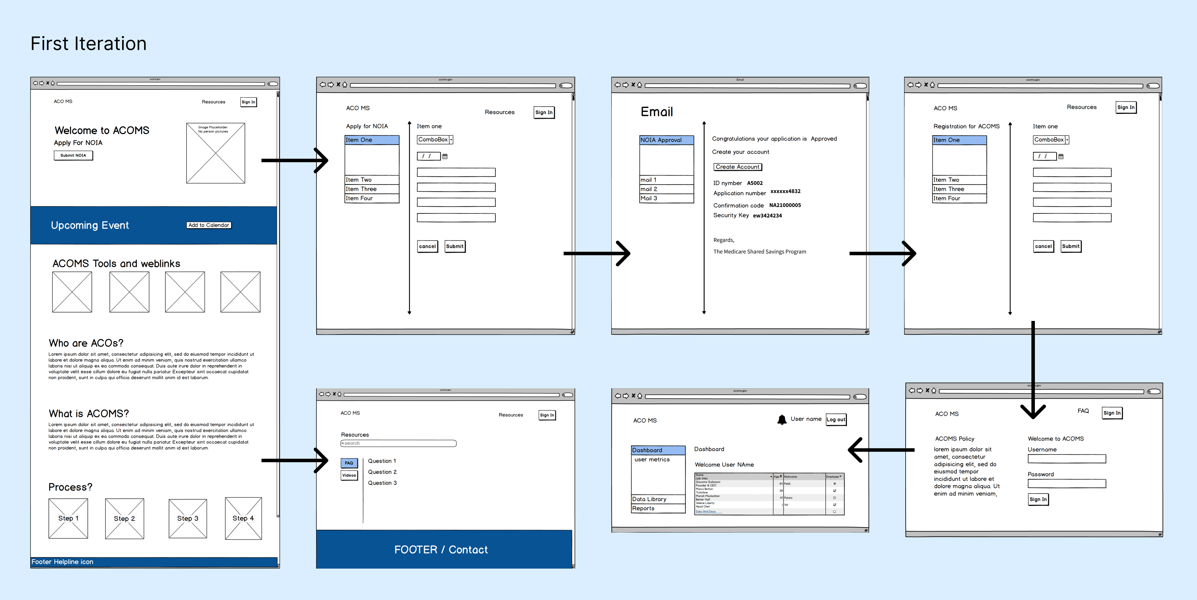
Wireframes & User Research
For the design process, I started with a series of wireframes to build the initial structure and started discussing the flows with the product manager and lead business
analyst. They were really excited about the direction the wireframes and flow was going, so we scheduled standups every
day and brainstormed the flow using Balamiq. From these meetings, I was able to achieve a low-fidelity flow which
was used to conduct usability testing to validate our assumptions.
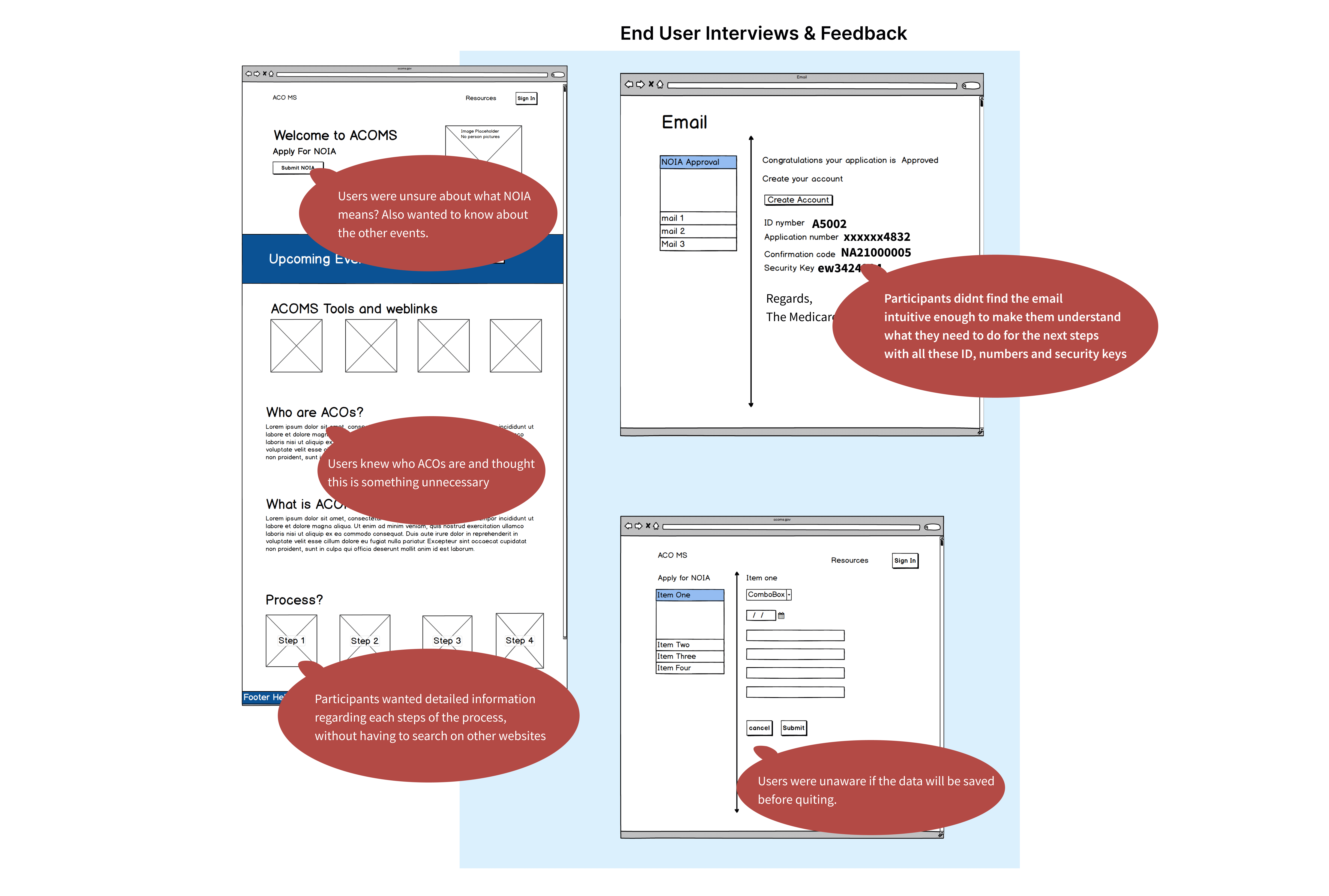
We conducted a usability test session using the wireframes and asked user to talk out loud while completing tasks.
The users were really happy about direction of the flow and gave their own feedback. Some of the feedback is displayed below:
Branding
Once the wireframes were done, I turned my focus to the branding. There are two goals of our visual make over -
1. Convey the message that ACO-MS matches CMS's culture. I wanted the product to be approachable for users since it's being associated with CMS.
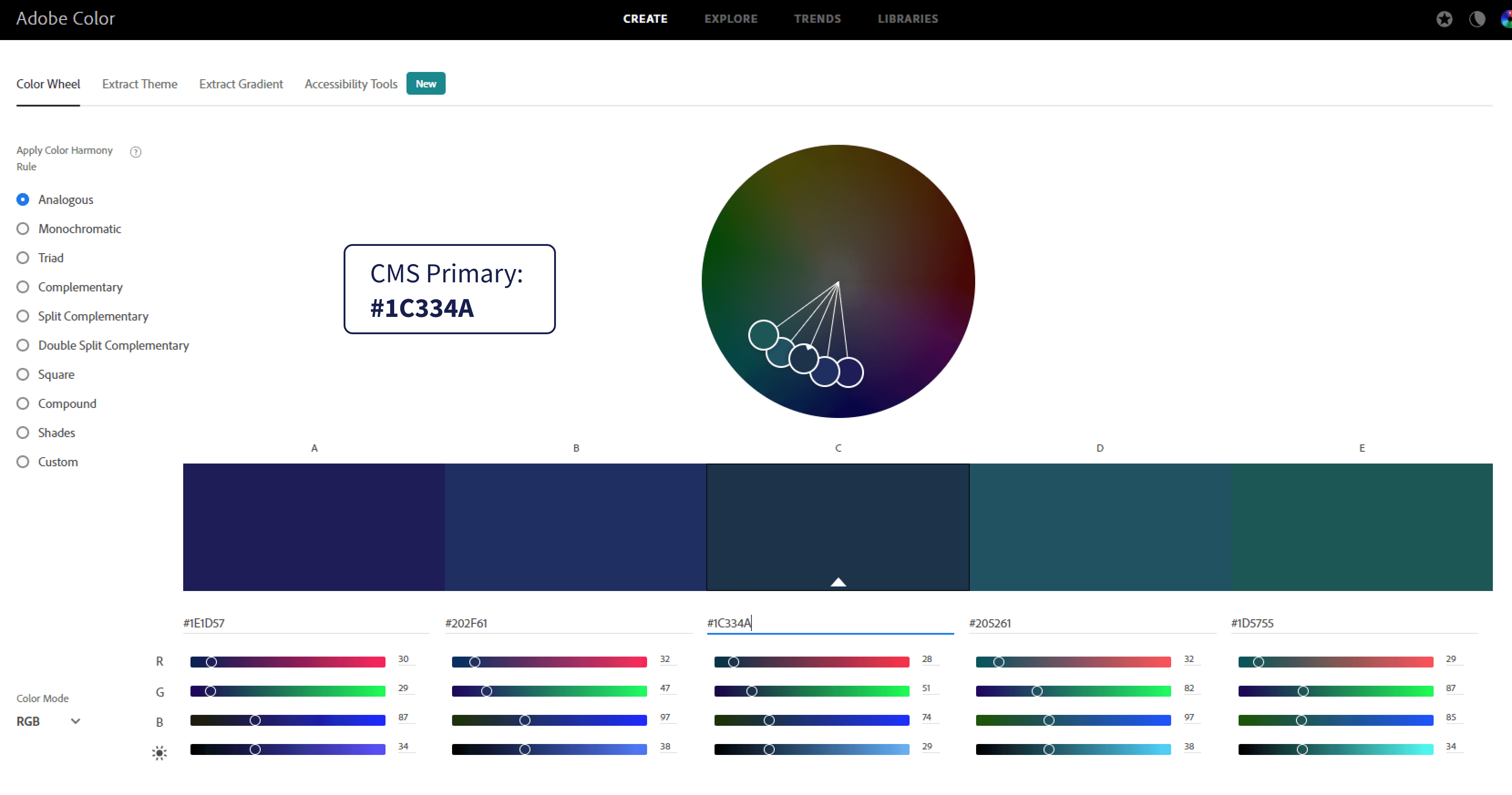
I started to incorporate colors that match CMS color palette while giving it a new look and feel. I used 'Adobe color' app to create the color theme.
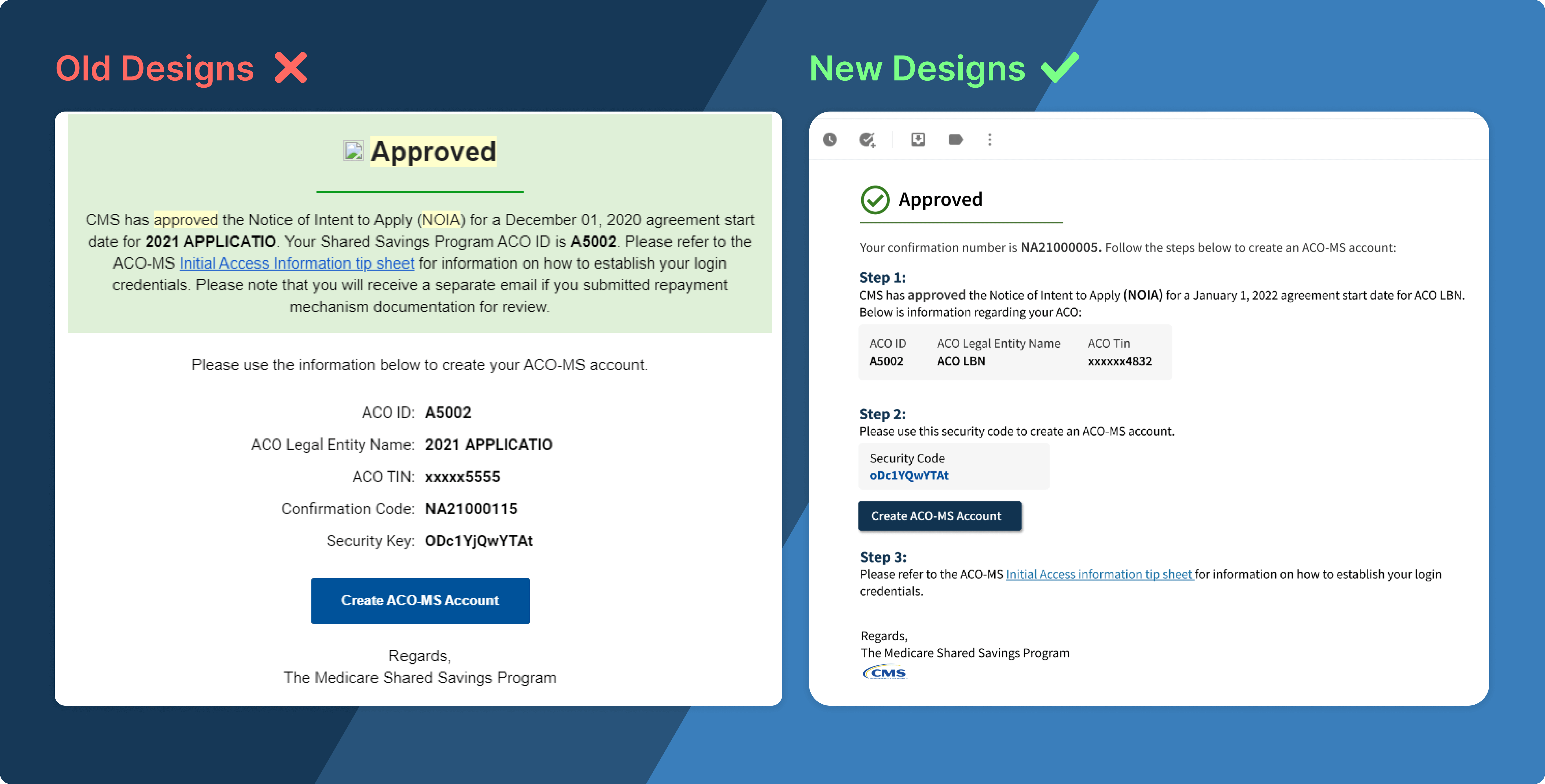
2. The system lacked proper padding and text spacing, which made it very difficult for users to focus on the content. So a total visual overhaul was needed to make the experience useful, meaningful and enjoyable for users.
UI Style Guide

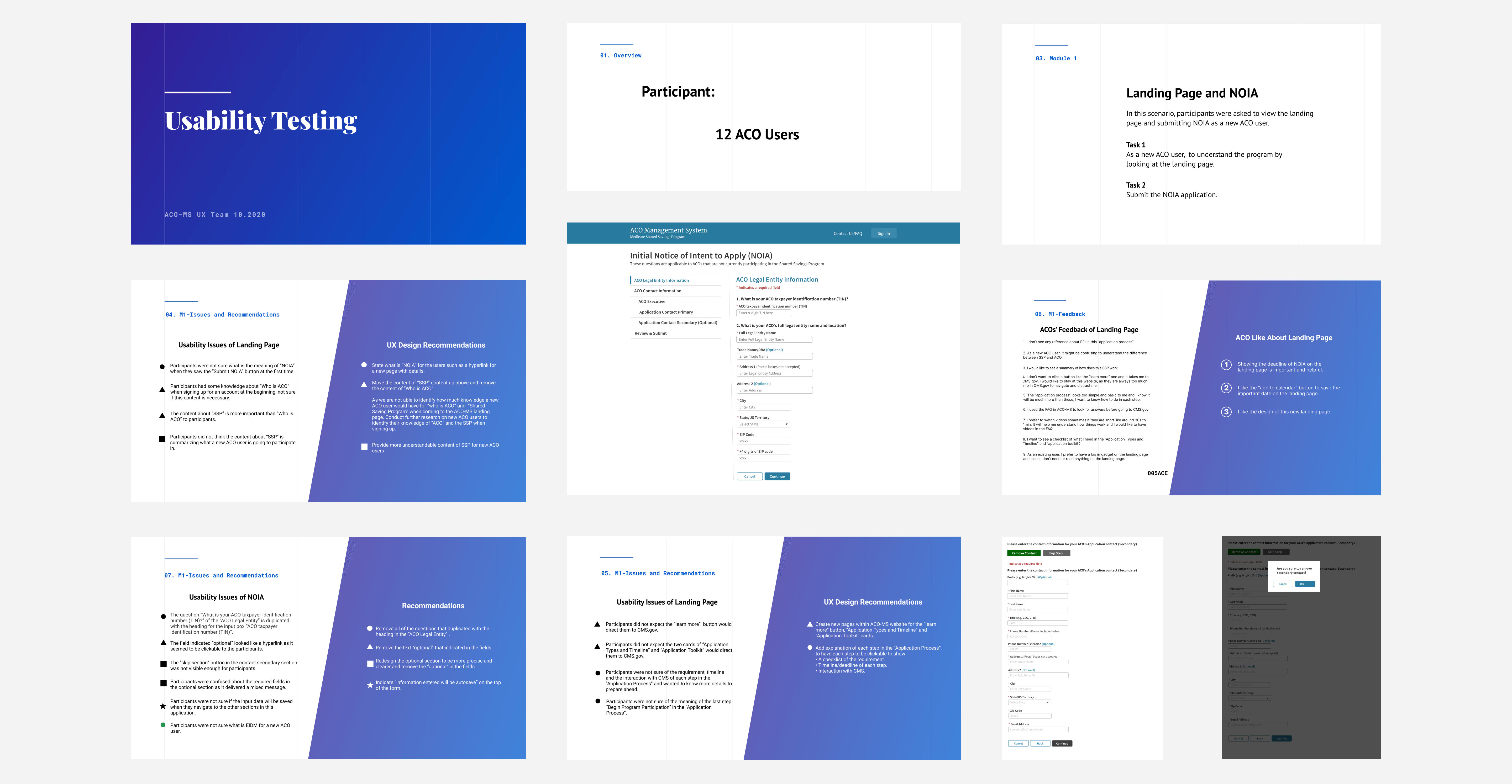
Hi-fidelity Prototypes and Usability Testing
To provide an accurate representation of the redesign, high-fidelity mockups were developed using Figma. These mockups incorporated user feedback from wireframes and adhered to the UI patterns outlined in the style guide, ensuring a consistent user experience across the product. By conducting usability tests, valuable feedback was gathered from users.
Additionally, I performed 508 compliance tests on the prototypes to ensure accessibility standards were met.
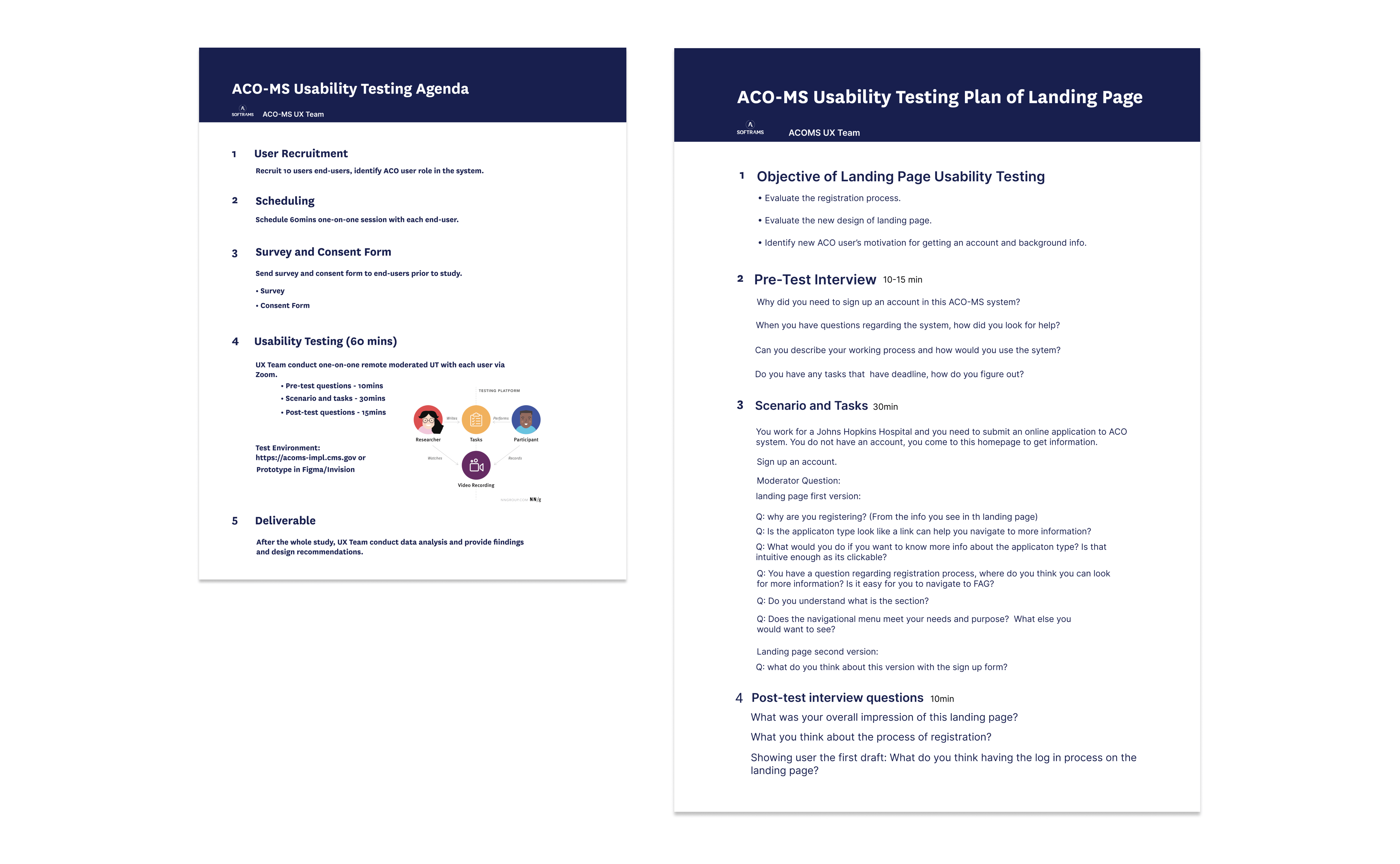
Research: Usability Testing
We prepared and sent out user-surveys and questionnaires to 12 users, out of which few were doctors and others where users working in organizations prior to the usability test.
We were able to do a mixture of guerrilla tests with the users.
 We made several incremental changes
maintaining visual clarity and user friendly flows over the course of 2 weeks of rapid iterative and evaluation testing.
We made several incremental changes
maintaining visual clarity and user friendly flows over the course of 2 weeks of rapid iterative and evaluation testing.
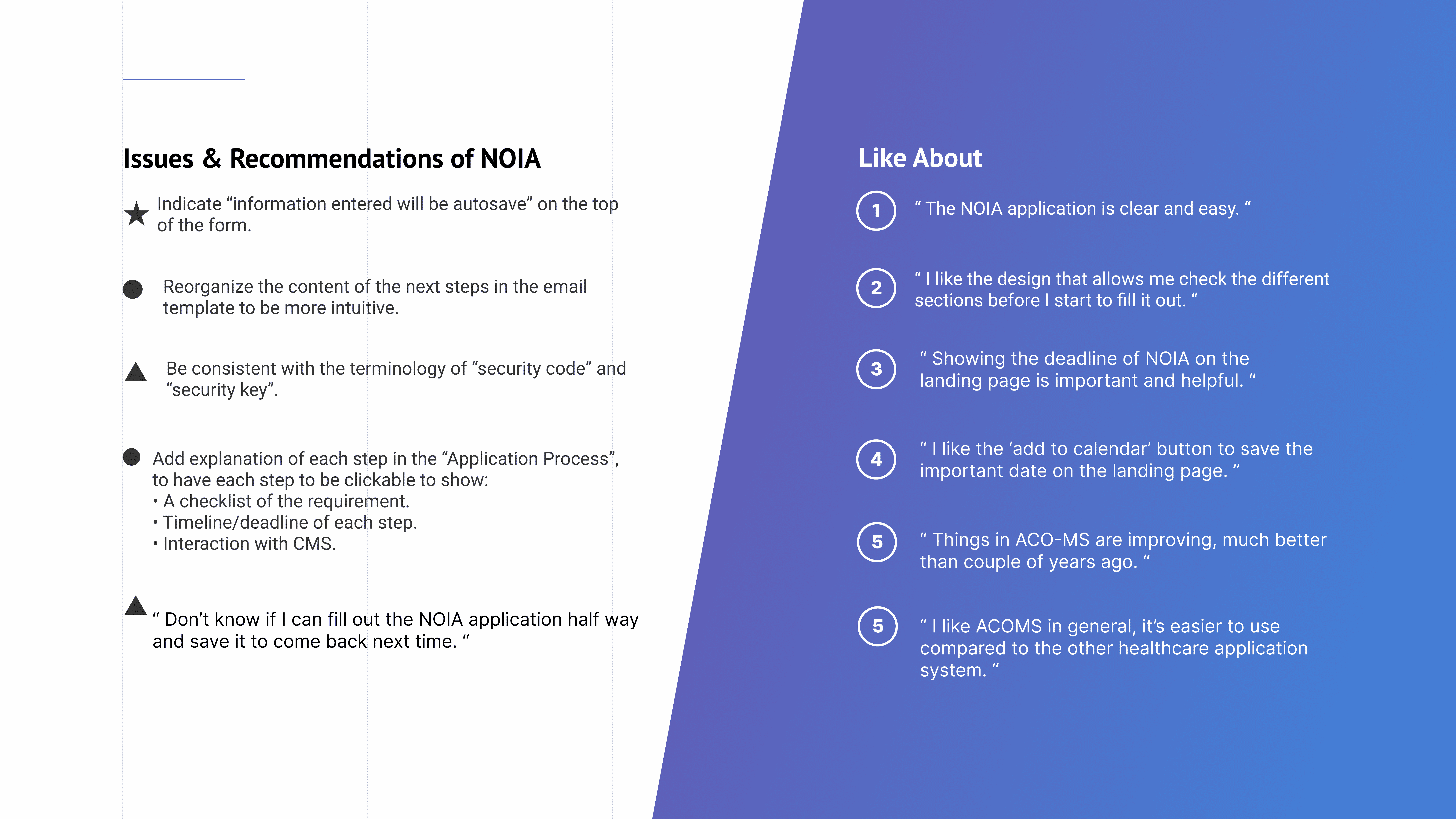
Research Findings
We received a lot of valuable feedback from the usability sessions. We dicussed the changes with the product managers and scoped down the changes that we wanted to implement. Below are few of the usability testing results.
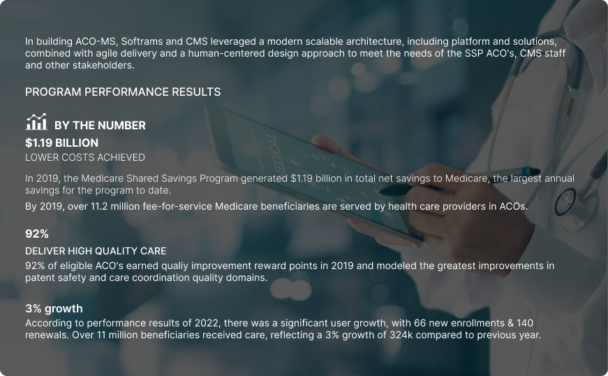
PROGRAM PERFORMANCE RESULTS